Ortvest
Brand mark for an IT studio – clean geometry, innovation, and variations built for product and corporate use.
Logo Design + Brand Identity
The problem
Ortvest needed a logo that reflects modern software craftsmanship – clear at favicon size, strong on pitch decks, and consistent across product UIs and marketing.
What it had to do
We designed a sleek mark with light and dark variations, strict geometry, and guidelines for digital-first use. The identity scales from app icons to large-format print without rework.
What you get
Key features.
Primary mark
Memorable symbol that works alone or with the wordmark.
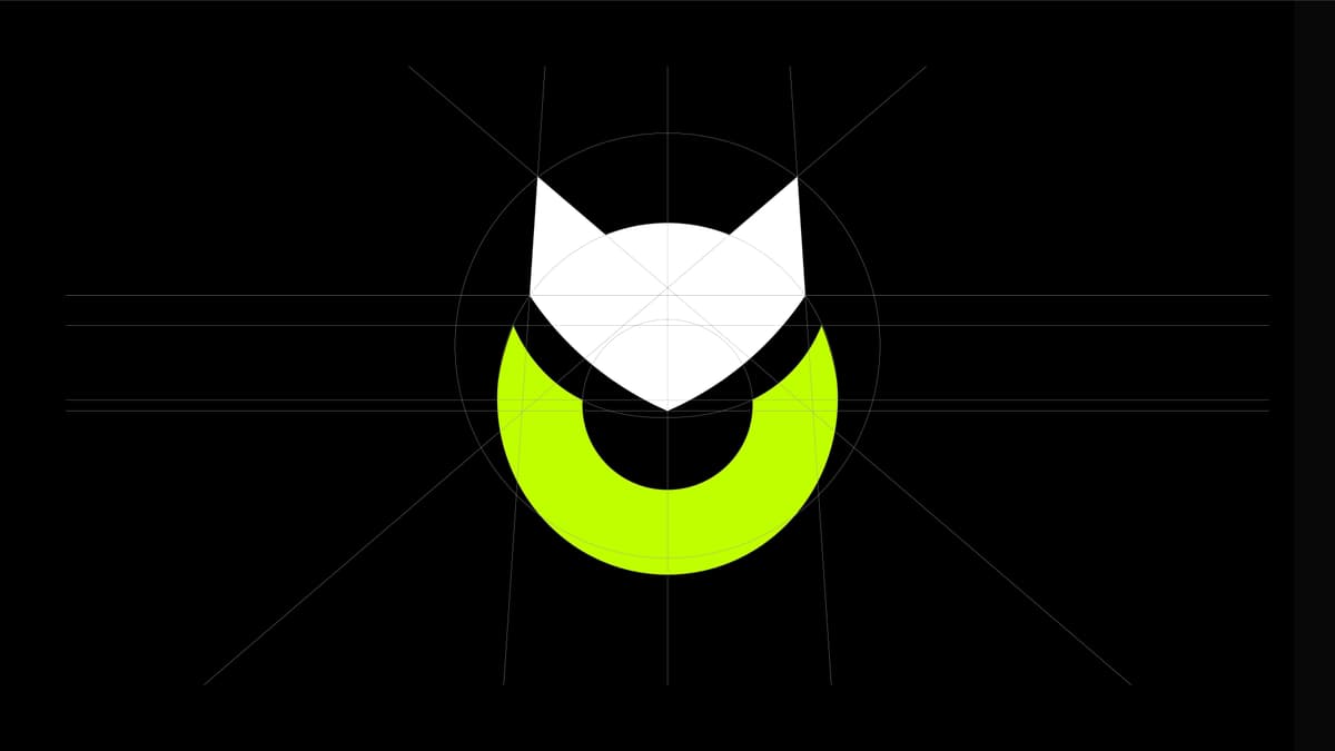
Clean geometry
Precise shapes that stay sharp at any resolution.
Color modes
Light, dark, and monochrome versions for any background.
Light & dark lockups
Ready for headers, footers, and product chrome.
Product-ready
Sized and spaced for apps, docs, and developer tools.
Brand guidelines
Usage rules for partners and internal teams.
Need a brand identity or visual system?
Get in touchNext case · Community
YachtMate