[Re.] skin&hair
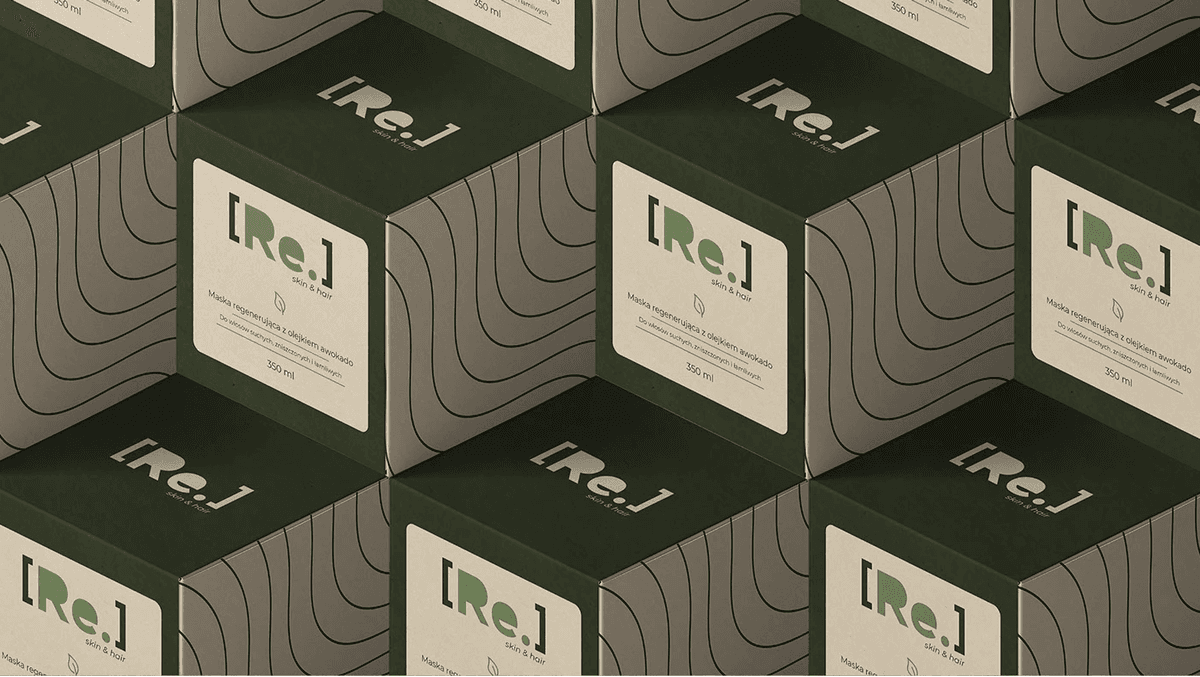
A minimalist brand system for a skin and hair care line – organic shapes, premium feel, and consistency across touchpoints.
Brand · Brand Identity + Visual Design
The problem
A beauty brand entering a crowded market needed identity that feels premium and clean without cold minimalism – communicating quality and trust at first glance.
What it had to do
We developed a full brand system: logo mark, color palette, typography, packaging direction, and usage guidelines. Organic shapes and warm neutrals balance modern simplicity with approachable luxury.
What you get
Key features.
Logo system
Primary mark and variations for product, packaging, and digital.
Color palette
Warm neutrals and accent tones that signal quality and calm.
Typography
Type pairing for headlines, body, and product labels.
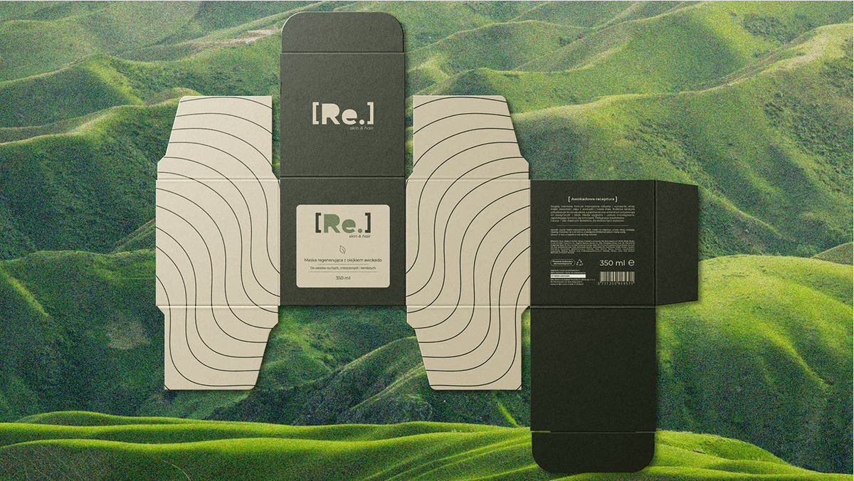
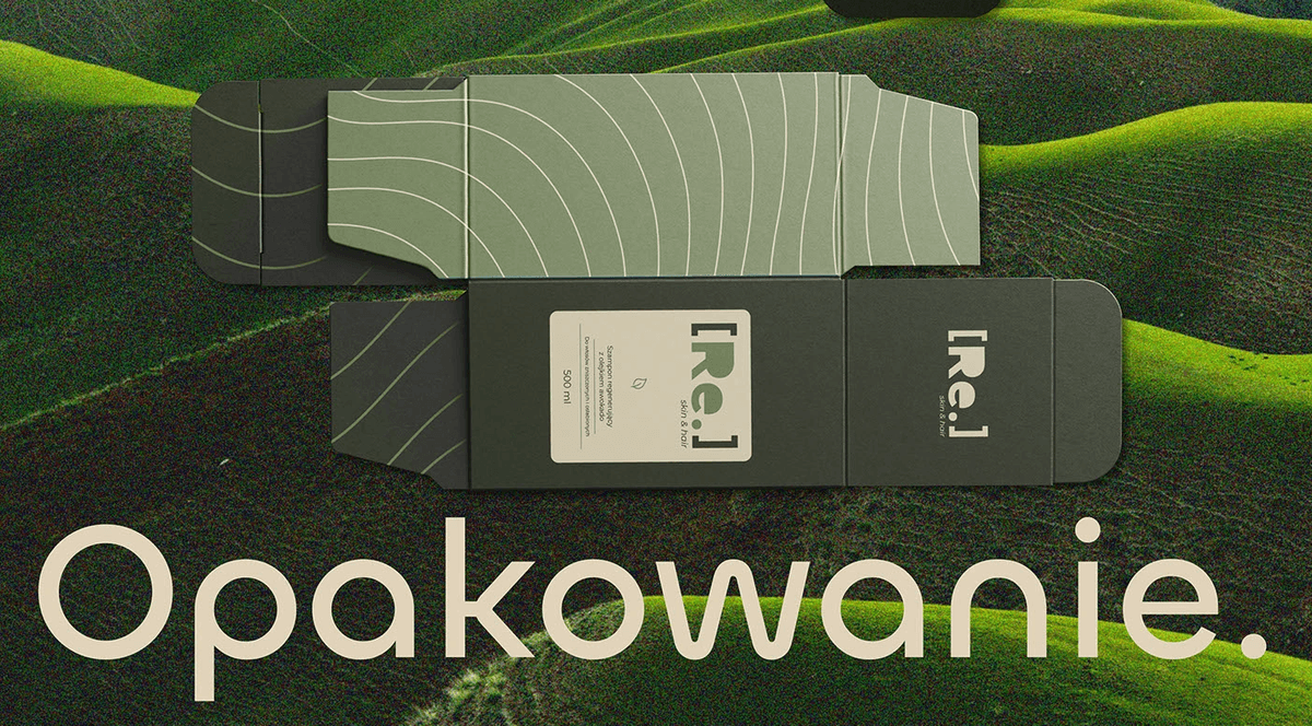
Packaging direction
Layout principles for bottles, boxes, and retail presence.
Brand guidelines
Rules for spacing, color use, and tone across channels.
Applications
Mockups showing the system on web, social, and print.
How we got there
How we built it.
01
Brand Identity
Developed the complete brand identity – logo, visual system, packaging direction, and brand guidelines for a clean, modern beauty brand.
Need a brand identity or visual system?
Get in touchNext case · Community
YachtMate