Gambit
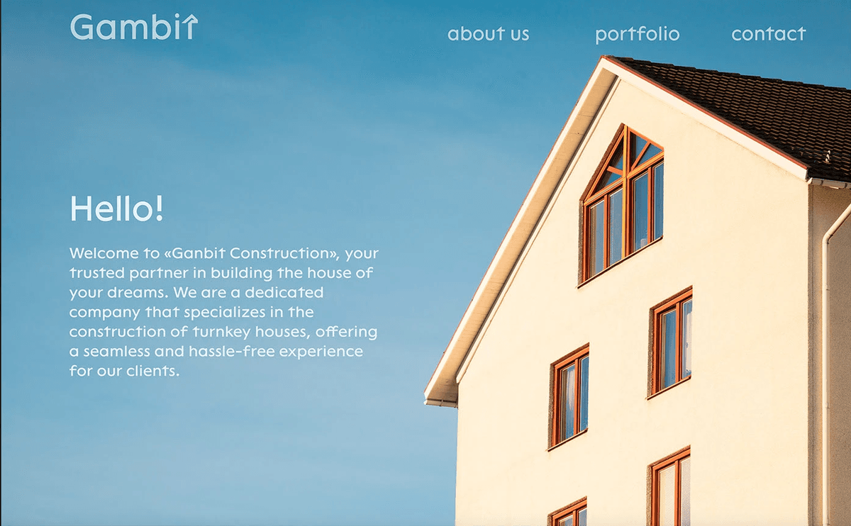
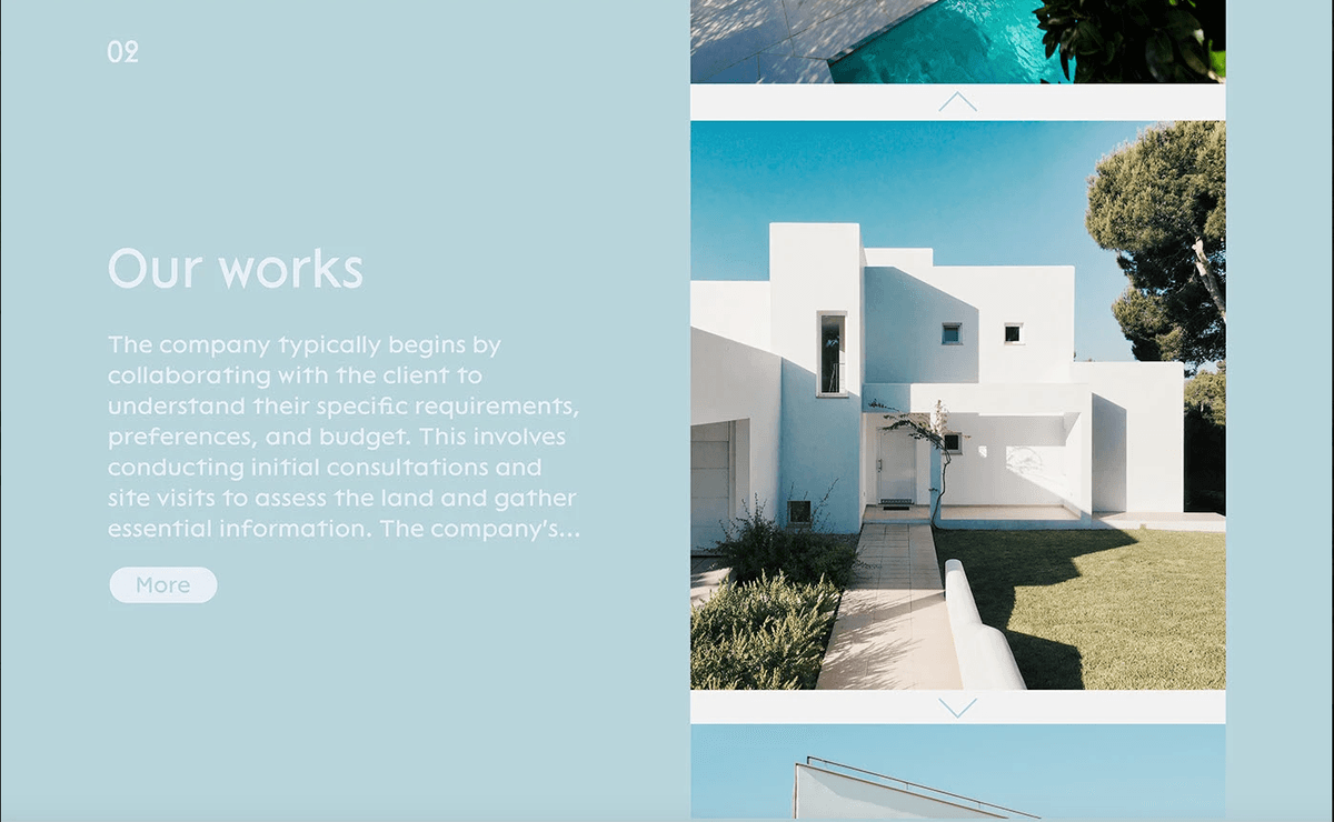
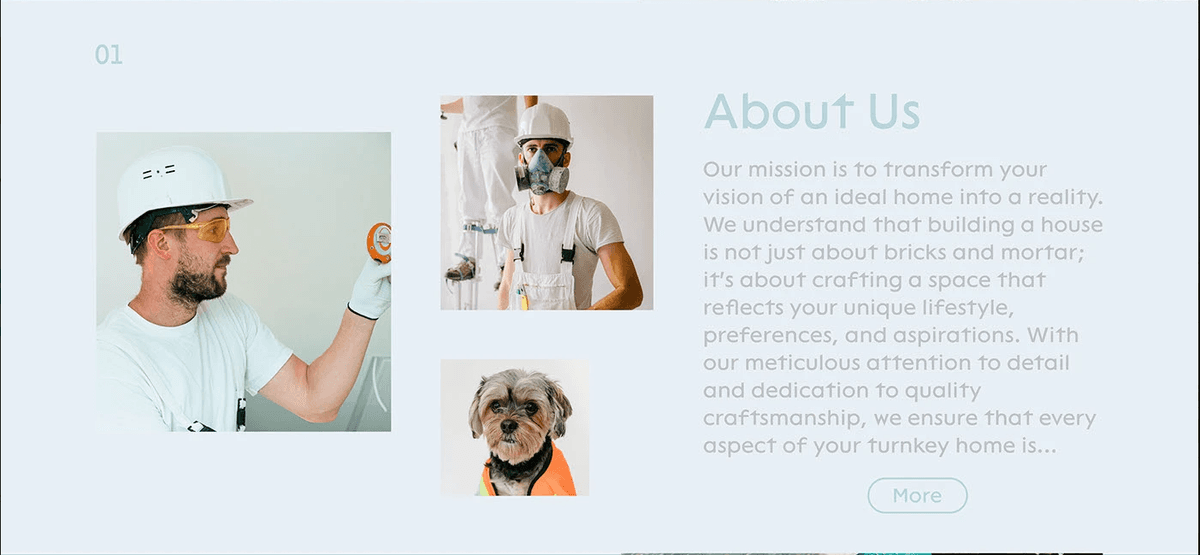
A modern website UI with bold typography, clear hierarchy, and whitespace that guides attention – designed for impact and usability.
Design · Development · UI Design + Web Design
The problem
The site needed a visual refresh that feels contemporary and credible – improving scanability and engagement without losing brand recognition.
What it had to do
We redesigned key pages with a strong type scale, consistent component library, and deliberate whitespace. Every section has a clear hierarchy so users know where to look and what to do next.
What you get
Key features.
Visual hierarchy
Clear levels of headline, subhead, and body that guide the eye.
Bold typography
Expressive type choices that reinforce brand personality.
Strategic whitespace
Breathing room that reduces noise and highlights CTAs.
UI components
Reusable cards, buttons, and sections for consistent implementation.
Responsive layouts
Grid and breakpoints planned for seamless dev handoff.
Dev-ready handoff
Organized Figma files with specs for efficient build.
How we got there
How we built it.
01
UI Redesign
Redesigned the visual language – typography, spacing, hierarchy, and color – to create a site that commands attention and guides the visitor toward action.
02
Development
Implemented the new design with performance optimisation, smooth animations, and clean component structure.
Have a product idea to build?
Get in touchNext case
[Re.] skin&hair